Every year the big paint brands each name a Color of the Year, and every year it gets harder to keep track of them. For 2027 almost all of them have now announced, and the picks tell a clear story: green is back in a big way, blue is the runner-up, and warm earthy browns and terracottas are filling in the rest. Only Pantone is still to come.
Below you’ll find every brand’s 2027 color in one place, with the paint code you need to buy it, what each shade actually looks like, and practical ideas for using it at home without regretting it six months later.
Every 2027 Color of the Year at a glance
| Brand | 2027 color | Code | What it looks like |
|---|---|---|---|
| Sherwin-Williams | Celery | SW 6421 | Soft, airy herbal green with a yellow undertone |
| Benjamin Moore | Webster Green | HC-130 | Classic mid-tone green, balanced between blue and yellow |
| Behr | Grounded | T27-01 | Mossy olive green with brown undertones |
| Dulux | Soulful Sage | – | Soft, silvery grey-green |
| Valspar | Cottage Door | 8004-38E | Steely, greyed mid-tone blue |
| Glidden (PPG) | Artifact | PPG10-16 | Smoky, cool blue |
| Dutch Boy | Deep Rooted | 311-7DB | Earthy terracotta orange |
| Dunn-Edwards | French Press Coffee | – | Deep brown with a purple undertone |
| C2 Paint | Pueblo | – | Rosy plum that shifts with the light |
| Graham & Brown | Rose Earth | – | Warm neutral inspired by Italian clay |
| Minwax (wood stain) | Pickled Oak | – | Light, airy whitewashed wood finish |
| WGSN and Coloro | Luminous Blue | – | Rich sapphire blue, between lapis and cobalt |
| Pantone | Not announced yet | – | Usually revealed in early December |

The greens: the big story of 2027
Four major brands landed on green, but they are very different greens. Knowing which one you’re looking at is the key to using it well.
Sherwin-Williams: Celery (SW 6421)
Sherwin-Williams describes Celery as an airy, herbal green. It is the lightest of the 2027 greens: a soft, muted pastel with a gentle yellow undertone that keeps it from looking cold. Think of the inside of a celery stalk rather than a bright lime.
Where it works: kitchens, breakfast nooks, bathrooms and sunny bedrooms. Because it is light, it is also one of the easiest 2027 colors to use on all four walls of a small room. Sherwin-Williams pairs it with the deeper green Artichoke (SW 6179), the soft white White Flour (SW 7102) and the warm neutral Woven Wicker (SW 9104). For contrast, its suggested palette also includes Plum Brown (SW 6272) and the cherry red Kirsch Red (SW 6313).

Benjamin Moore: Webster Green (HC-130)
Benjamin Moore calls Webster Green “the quintessential shade of green”. It sits right in the middle: not too light, not too dark, balanced between the calm of blue and the warmth of yellow. It comes from the brand’s Historical Colors collection, so it has a classic, slightly traditional feel, but it is meant to look current rather than nostalgic.
Where it works: living rooms, dining rooms, studies and kitchen cabinets. It looks rich next to brass, walnut, leather and cream. Benjamin Moore’s Color Trends 2027 palette builds around it with Nelson Blue (CW-635), White Down (OC-131), Wild Aster (1240), Shakespeare Tan (228), Antique Copper (1169), Townsend Harbor Brown (HC-64) and Durango (2137-30).
Behr: Grounded (T27-01)
Behr’s pick is the earthiest of the greens: a mossy olive with brown undertones. In daylight it reads green; in the evening it moves towards khaki and brown. That makes it a natural partner for wood, terracotta, rattan and linen.
Where it works: bedrooms, home offices, mudrooms and exterior doors. It also makes a good alternative to grey on kitchen cabinets if you want color that still feels neutral.
Dulux: Soulful Sage
Dulux chose a soft, silvery grey-green. It is the quietest of the four, and the one to pick if you like the idea of green but are used to living with grey. It suits north-facing rooms where stronger greens can look murky.
The blues: calm, cool and a little moody
Valspar: Cottage Door (8004-38E)
Valspar was the first brand to announce for 2027. Cottage Door is a steely, greyed mid-tone blue, the kind of color you might see on a painted front door in an English village. It is soft enough for a whole room but has enough depth to work on cabinetry and furniture.

Glidden: Artifact (PPG10-16)
Glidden’s Artifact is a smoky blue, quite close to Valspar’s choice but a touch cooler and moodier. It looks particularly good in bedrooms and dens, and as a backdrop for art: a framed gallery wall on smoky blue looks far more finished than the same frames on white.

WGSN and Coloro: Luminous Blue
Trend forecasters WGSN and Coloro pick a color for fashion, beauty and products as well as homes. For 2027 they named Luminous Blue, a rich sapphire somewhere between lapis lazuli and cobalt. It is far brighter than the paint brands’ blues, so at home it works best in small doses: a velvet cushion, a glazed vase, a painted chair or a bold front door.
The warm earth tones: terracotta, coffee and clay
The third group of 2027 picks moves away from cool colors altogether and towards the warm, earthy shades that are replacing grey in so many homes.
- Dutch Boy: Deep Rooted (311-7DB). An earthy terracotta orange with a muddy, greyed edge, so it feels warm rather than loud. Lovely in dining rooms and on a single piece of furniture.
- Dunn-Edwards: French Press Coffee. A deep, chocolatey brown with a subtle purple undertone. Brown walls are having a real moment; use it in a library corner, a powder room or on a ceiling.
- C2 Paint: Pueblo. A rosy plum that changes a lot with the light, looking pink in the morning and almost brown at night.
- Graham & Brown: Rose Earth. A warm neutral inspired by Italian clay. If you want a 2027 color that behaves like a neutral, this is the one.
- Minwax: Pickled Oak. Not a paint but a wood stain: a light, whitewashed finish that brightens floors, tables and shelves and pairs well with every color above.

What about Pantone’s Color of the Year 2027?
Pantone has not announced its 2027 color yet. It traditionally reveals its pick in early December, a few months after the paint brands. Pantone’s choice is aimed at fashion and design as much as homes, so it doesn’t always come with a ready-to-buy paint. We’ll add it to this article as soon as it is announced.
How to use the 2027 colors at home
Living room
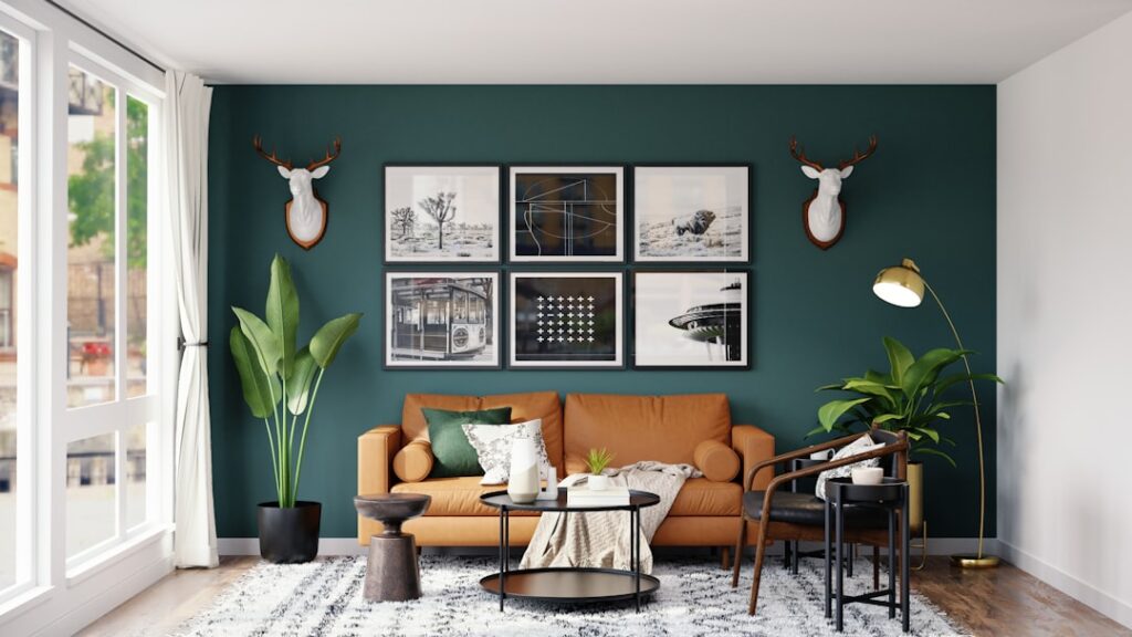
A mid-tone green like Webster Green or a smoky blue like Artifact makes a living room feel cozy and finished, especially with warm wood, leather and brass. If painting the whole room feels like too much, paint the wall behind the sofa and the ceiling in the same color. Keep the rest of the room in warm neutrals so it feels calm rather than busy. Our living room ideas have more layouts to try.

Kitchen
Kitchens are where the 2027 colors shine. Paint lower cabinets in Grounded, Webster Green or Cottage Door and keep the upper cabinets or open shelves light. Brass or bronze handles finish the look. Celery is a gentle option for walls or a tiled backsplash. See our kitchen ideas for budget updates.
Bedroom
Bedrooms suit the calmer shades: Soulful Sage, Cottage Door, Artifact or Grounded. Try “color drenching”, painting walls, trim and even the ceiling in one color, for a soft, enveloping effect. Add linen bedding in white or oatmeal so the room doesn’t feel dark. More ideas are in our bedroom ideas guide.
Bathroom and small spaces
Small rooms are the safest place to try a bold 2027 color. French Press Coffee or Deep Rooted in a powder room feels dramatic in the best way, and it is a weekend project. Pair it with brass faucets, a round mirror and white sanitaryware. Our bathroom ideas cover small-space tricks.
Color combinations that work
- Green + walnut + cream: Webster Green or Grounded with dark wood and a warm white. Classic and cozy.
- Celery + soft white + natural oak: fresh and light, ideal for kitchens and small apartments.
- Smoky blue + terracotta: Artifact or Cottage Door with Deep Rooted accents, such as pots, cushions or a rug.
- Olive + plum: Grounded with touches of Pueblo or a plum-brown for a moody, grown-up look.
- Brown + pale pink: French Press Coffee with Rose Earth or blush textiles. Warm and surprisingly soft.
- Blue and white: any of the 2027 blues with crisp white and striped or patterned textiles, a look that never really goes out of style.

How to choose the right 2027 color for your home
- Check your light. North-facing rooms make colors look cooler and darker, so choose the warmer options (Celery, Grounded, Rose Earth). South-facing rooms can take cooler blues and deeper greens.
- Look at the undertone. Hold the sample next to your floor, sofa and kitchen countertop. A green with a yellow undertone will feel warm next to oak; one with a grey undertone will feel cooler.
- Sample big. Paint a large sample board (at least 12 by 12 inches) or use a peel-and-stick sample, and move it around the room for a couple of days. Look at it in the morning, afternoon and under lamps at night.
- Start small. A front door, a piece of furniture, a bathroom or kitchen island is a low-risk way to test a trend color before committing to a whole room.
- Choose a finish to match the job. Eggshell or matte for walls, satin or semi-gloss for cabinets, doors and trim.
For the bigger picture of where interiors are heading next year, read our home decor trends 2027 roundup, and for style inspiration see our guide to interior design styles. If you’d rather start with a weekend project, our DIY home decor ideas include plenty of painted pieces.
Frequently asked questions
What is the Color of the Year 2027?
Each brand picks its own. For 2027, Sherwin-Williams chose Celery (SW 6421), Benjamin Moore chose Webster Green (HC-130), Behr chose Grounded (T27-01), Valspar chose Cottage Door (8004-38E), Glidden chose Artifact (PPG10-16) and Dutch Boy chose Deep Rooted (311-7DB). WGSN and Coloro named Luminous Blue. Pantone has not announced yet.
When will Pantone announce its 2027 Color of the Year?
Pantone usually announces its Color of the Year in early December. We will update this article when it does.
What is the most popular paint color trend for 2027?
Green. Sherwin-Williams, Benjamin Moore, Behr and Dulux all chose a green, ranging from pale herbal Celery to mossy olive Grounded. Blue and warm earth tones such as terracotta and brown are the other two big themes.
Is Webster Green a dark green?
No, it is a mid-tone green. It is deeper than sage or Celery but lighter than forest or hunter green, which is why it works on walls as well as cabinets.
Will the 2027 colors date quickly?
Muted, earthy shades like these tend to age well because they behave almost like neutrals. If you’re worried, use the bolder picks such as Luminous Blue, Pueblo or Deep Rooted on things that are easy to change, like cushions, a chair or a door, and keep walls in the softer greens and blues.
Sources
Color names, codes and descriptions come from the brands’ own announcements, including Sherwin-Williams Color of the Year 2027, Benjamin Moore Color Trends 2027 and Behr Grounded, as well as the roundups by Young House Love and PaintMatch. Paint colors look different on screen and in different light, so always test a sample at home before buying.

Written by
Ideas, guides and real budgets for home, garden and travel, published on World inside pictures since 2013.