 World inside pictures Collect and share the best ideas that make our life easier
Many companies and brands that we know today have iconic names and logos, so much so that you can recognize them at a glimpse or visualize their logo when their name is uttered. However, most of these companies have gone through a long process of innovation and evolution before they came to be known for the brand they are today.
When you hear of “Google” you can almost instantaneously envision the iconic, colorful lettering of the most frequently used search engine in the world. On any given day, Google sees roughly 63,000 searches per second on it search engine. For context, this translates to 228 million searches per hour, 5.6 billion searches per day and over 2 trillion searches per year.
Today, Google’s logo is one of the most commonly recognized logos across the planet, which is a curious fact when you realize how “Google” wasn’t even the original name of this one company that we can’t imagine internet without.
The Start of Google: Backrub
Hearing about it now makes one wonder about the strange nature of the name for a search engine, a name that was later changed to Google. But there was sound logic to the name “BackRub” since it was named according to its function, which was to search through Internet backlinks.
This started in 1996 when the founders of Google, Larry Page and Sergey Brin, came up with the idea to create a web crawler that would analyze backlinks pointing to different pages on the internet when a keyphrase was entered and display the most relevant results.
The BackRub logo was fairly plain and consisted of text in a deep shade of crimson. The font was thick, bold, and in your face:

(picture taken from https://commons.wikimedia.org/wiki/File:BackRub_logo_(1996-1997).svg)
The chief quality of this straightforward logo is that it was easily readable font. There was nothing exceptional or eye-catching about the logo but it is important to remember that the company was just starting out and perhaps needed their name to be heard and seen as clearly as possible.
The Most Iconic Spelling Mistake Ever.
In 1997, the company which would soon go on to be a multi-billion dollar entity that indirectly influences pretty much all of internet changed its name to Google. The name was originally intended to be “Googol”. A Googol is 1 raised to the power 100. That means 1 with 100 zeros.
Page and Brin thought that as the search engine would give you large quantities or ‘Googols’ of results, it was aptly named.
Interestingly, a spelling mistake when checking internet domain name registry database for availability made them stick with the name “Google” rather than “Googol”. Of course, the name change meant that a new logo was in order.
![]()
(image taken from https://static.wikia.nocookie.net/logopedia/images/a/a0/Google_1997.svg/revision/latest?cb=20201017233007)
This logo was used in 1997, during the development stages of Google at Stanford University. At this time, Google was not a company and this logo was just a placeholder for what was to come. However, it shows that how even now, two decades later, the current logo is still inspired by the original design.
Continued Evolution of Logo
In the 22 years that Google has been around for, it has gone through a number of redesigns with its logo but it has always stayed true to its roots.

(image taken from https://static.wikia.nocookie.net/logopedia/images/a/ab/Google_logo_Sept-Oct_1998.png/revision/latest?cb=20190227182150)
In 1998, Google saw what is perhaps the most drastic change in its logo design. The color scheme was finalized with the uppercase “G” and the “l” in green, the first “o” and the “e” in red, the second “o” in yellow, and the lowercase “g” in blue. A new typeface, known as Baskerville Bold was used and the logo was created with the help of a free graphics program, GIMP.
While this logo set the theme for what was to come, it is also perhaps the most distinct from its successors due to the coloring of the letters which was initially decided upon.
This version of the logo did not last very long and ended up being replaced within the same year. In the August of 1998, the “G” of the logo was give the color blue instead of green, the logo was resized to be a bit smaller, and there was a shadow added which made it seem as if the logo was floating.
(image taken from https://static.wikia.nocookie.net/logopedia/images/b/b7/Google1998.png/revision/latest/scale-to-width-down/300?cb=20150102234137)
If you search for “Google in 1998”, this is the logo that appears along with the interface looking like how it did in 1998. However, this logo was also short-lived.
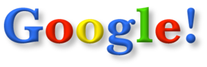
On May 31, 1999, Google unveiled the symbol that would be used as the basis for its logo for over 15 years. This logo was professionally made and is the logo users most commonly remember due to the longevity of it. Designed by Ruth Kedar, the logo used the Catull BQ typeface. The exclamation mark was also removed.
(image taken from https://static.wikia.nocookie.net/logopedia/images/6/67/Google_logo_colour.svg/revision/latest/scale-to-width-down/300?cb=20180805063129)
Between 1999 and 2015, the Google logo saw numerous but low-magnitude changes. Adjustments to the color or tweaks to the shadows were made but the logo largely remained unchanged. Perhaps the most significant change to the logo came about in 2013 when the 3D effect was dropped in favor of a two-dimensional effect, as that suited the theme Google was following.
It was also at this time when Google adopted “Material Design”.
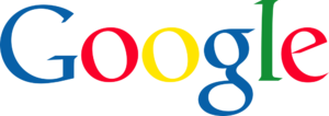
In September of 2015, Google introduced the logo that is closest to how we recognize it today. With a completely new look, design, font and feel, the logo had been overhauled entirely.
The logo was redesigned in order to bring it closer to the clean, uncluttered UI/UX trend that is in vogue today, with comfortable colors that are easy on the eyes. Product Sans was chosen as the typeface for the logo. This logo is still in use today.

(image taken from https://static.wikia.nocookie.net/logopedia/images/2/28/Google_2015.svg/revision/latest/scale-to-width-down/300?cb=20190213113946)
Enter Doodles
It would be criminal to not mention Google’s infamous doodles. Google temporarily changes its logo in order to commemorate events and iconic people. These are often regionally targeted and range from independence days to birthdays and anniversaries.
Doodles are commonly GIFs or eye-catching animations that celebrate cultural events, helping people feel an emotional connection to Google. In the past 20 years, Google has made over 4,000 doodles. There is an entirely separate team of designers for this purpose and they are known as “Doodlers”.
Finishing Up
The history of Google’s logo is as colorful as the logo itself. Google is one of the harbingers of the tech-fueled world that we know today, having played a prominent role in some of the most cutting-edge technology and development in the world. With warm colors and trend-defining designs, Google’s logo evolved into one of the most iconic of all time.


