 World inside pictures Collect and share the best ideas that make our life easier
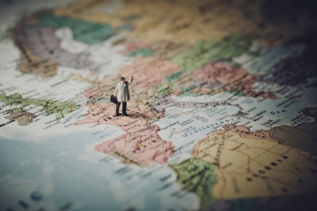
Maps are perhaps one of the most intricate yet intriguing amalgamations of science, aesthetics and technique. It is quite fascinating to see the way a cartographer literally depicts reality on a paper and communicates the spatial information effectively.
Speaking of this, there is absolutely no short-cut to creating an accurate map. It is essential that the map crafter should have taken into consideration the navigation and other unique needs of the visitors in question. Hence, it requires great effort, a whole lot of time and diligence on a cartographer’s part. It is probably one of the most complex jobs out there!
Like every other design task, some principles that need to be followed strictly for one to create a practical map. It is to be noted that the following pointers discussed below cannot be taken as a comprehensive guide as one may need to add or omit as per the variation of the map under process. These points, however, will give you a start and will help you move from contemplation to execution. To put it precisely, it is for you to consider it as a guideline.
So, here are seven things that a cartographer should and must incorporate in their map-making process. It is important to note that all the below considerations should be taken into account once the map-maker has chosen the map orientation. To put things in perspective, a map is either portrait or landscape. It contributes a lot in the visuals as the features would be added as per the chosen orientation.
Now, let’s get started!
An Inset Map
Before we delve deeper, let’s first deduce what an inset map is. Well, typically, an inset map is a similar graphical representation of related themes regarding data upon which the main map is based upon. However, such a representation is somewhat at a smaller scale. Hence, the name is inset map.
Often, they are used to provide the users with an overview or a zoomed-in view of specific section or sections of the main map. They will either be in an open form or a closed form.
Moving on, a well-crafted map will always contain an inset map. It is needed as it puts the geography in perspective by portraying it, as discussed earlier, at a smaller scale. Moreover, it also simplifies features of the main map for a layperson to comprehend it easily. Therefore, make sure you do include one when you work on crafting a map.
Label Smartly
When you are aiming towards turning nothing into something, you got to do it smartly. Ensure that it serves the purpose and delivers it coherently.
There is absolutely no use of a map with a labeling too cluttered to read through. It is confusing and may we say best to be thrown into a dustbin. As a mapmaker, the primary goal should that of making a map crisply clear and super easy to read so as to then help with the assimilation.
Rudimentary rules for labeling
- First and foremost, labels go south to north and left to right.
- The lead lines should not overlap as it makes the whole map unreadable when you are trying to communicate a point.
- It is good to exercise offset; preferably on top.
- Font face, in addition to color and size needs to think well beforehand.
The Legend Talks Through
A key is required for one to break through the information a map contains. This key is what we call a map legend in pure cartographic jargon. Allow us to tell you that it is the driving-force of a map!
What is meant by Legend?
A map tends to convey the information through the help of symbols or colors. It offers clarity and ease when it comes to reading it. A legend in a map is simply showcasing the features of a map. To put it exactly, it has symbols with text beside it which tell what the symbols or colors in the map represent.
With a map containing a string of symbols, it is difficult to decode and understand what each represents. Therefore, this is one of the significant factors which should be pondered over much while designing a map. A map without legend is simple an incomplete and, actually a map devoid of purpose. Even those customized map wall art people get done for their rooms should have one!
In addition, be sure to keep the legend neat and ensure that the items are always aligned to the left.
The Metadata
Metadata is an essential component when you speak about Geographic Information Systems (GIS). Primarily, it stands alongside or as a part of a map legend. It summarizes the entire map into words so that the reader can relate with it.
What does metadata definitively mean?
It can be defined as a background information delivery the context, quality, condition and other crucial characteristics of the data. In other words, metadata provides with the gist of the data.
For instance, recall any of Google researches you did today. The phrase or clause which started you on the research is what metadata is typically. In a map, metadata serves the role of a narrator.
Also, the author of the map should be present in metadata so that it could be referred to in case it needs to be.
The Color Coding
To begin with, colors have a proven long-lasting impact on a consumer’s mind. The colors tend to strike a connection as soon as a person set his eyes for all the visual clarity it has to offer. They decipher the information on display for a person who is, basically, a layman where maps are concerned.
Hence, the use and choice of colors play a significant role in map-making as well. The inclusion of a color palette helps information like water, elevation, rough terrain or roads to stand out.
Let’s explore a few examples below
- Blue, in a map, generally represents water
- Green could depict vegetation
- Brown could be used to describe hills, mountains or a dry land
- Yellow could be used to highlight sunny weather
It is therefore very critical to make sure that the selected colors reflect the intended theme and purpose eloquently. It should very well relate or match with the component it is standing for in the map.
Be Careful with the Typeface
Deciding and selecting a typeface for your next map in the making can be a daunting task. It could either make the map or very conveniently break it.
Defining Typeface
It can refer to a group of fonts. They are used in combination to exhibit similarities in design. A typeface is also known as a font family.
Before we recommend the fonts to ponder over, let’s first establish a little knowledge about the font family. It will allow you to make a better decision.
There are two types of fonts, namely Serif and Sans Serif. These fonts serve the purpose equally in the world of cartography. However, they should be paired up smartly.
Difference between Serif and Sans Serif
Well, a serif font comes with added feet or extensions at the ends of the tops and bottoms of each character. For example, Times New Roman is a serif font. Whereas, a sans serif font, as the name suggests, comes without the extensions. Here sans, which is a French word, means ‘without’. So, the word is self-explanatory in this regard. The font Arial is a classic example if sans serif font family.
A serif font is ideal for labeling natural features such as water bodies, rivers or hills while a sans serif is more appropriate for labeling man-made features like roads, buildings or cities.
However, we do not recommend more than two font families to be used in a single map to maintain the sanctity. You got to be wise when you make a choice, cartographers!
The Disclaimer
With any map, mentioning a disclaimer should be the very first priority. When things are expected to go haywire, the same disclaimer could be the light at the end of what might seem an endless, dark tunnel. A cartographer might not include one, but it is definitely one of the many factors which should be considered. Since it addresses the legality of the maps, it can turn things in your favor should a need arise.
Speaking of this, get the disclaimer thoroughly checked by a legal representative before you move on to adding one in your map. Other than this, including a disclaimer, may as well add to the cartographer’s credibility and authenticity.
In light of the above discussion, we have pretty much talked about every aspect which will help you in crafting that perfect map you must be envisioning. Other than this, make it a point to do thorough proofreading, as in spell and fact-checking to avoid any discrepancies. Incorrect spelling in a map is the biggest turn-off and we are sure you wouldn’t want to risk that at all.